Role: UI/UX Programmer / Designer, Audio Engineer | Platform: PC | Engine: Unity
Sand Showdown was the result of the two-day EGaDS UT Austin 2025 game jam, and the theme was “Out of Time”! The game pits two genies stuck in an hourglass against each other. Each player is required to slap multiple pillars for the main one to pop up, and when slapping that one, it prompts an input mini-game that, when completed, fills the other side with sand. Whoever’s side fills up with sand loses.
-
![Figma]()
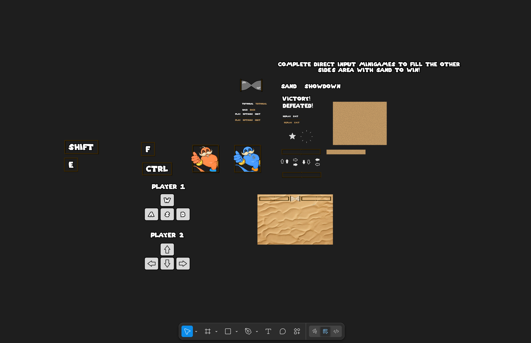
1. Figma & Getting Started
Time was short, and I couldn’t fully adopt my typical process when designing and laying out UI/UX. I usually start with journal sketches and move on to Photoshop, Illustrator, or Figma to begin digitally prototyping for a jam; however, I went straight to Figma.
While we were brainstorming and starting to move in the direction the game ultimately became, I made several mental depictions of how UI was going to look, feel, and the user experience of navigating it all. Throughout the process, I immediately got started on designing assets once I had an idea and it was approved by the team. This is my Figma board, and it includes every asset I made for the game.
-
![Main Menu]()
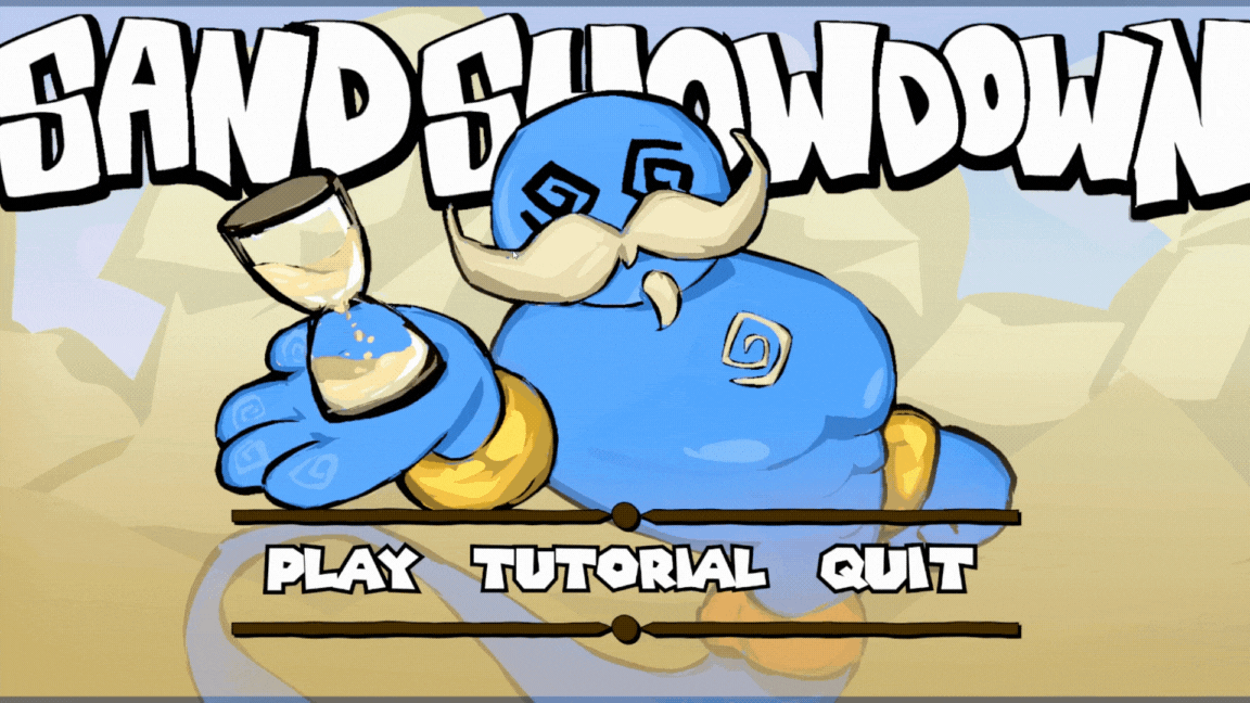
2. Main Menu
The first idea I had for the game’s UI design was the main menu buttons. Since the hourglass the player character’s preside in tilt in the direction of the losing player, I thought it would be fitting for menu buttons to reflect that. Depending on which button the player hovers over, it will tilt in that direction and “fill” the button with sand.
-
![Tutorial]()
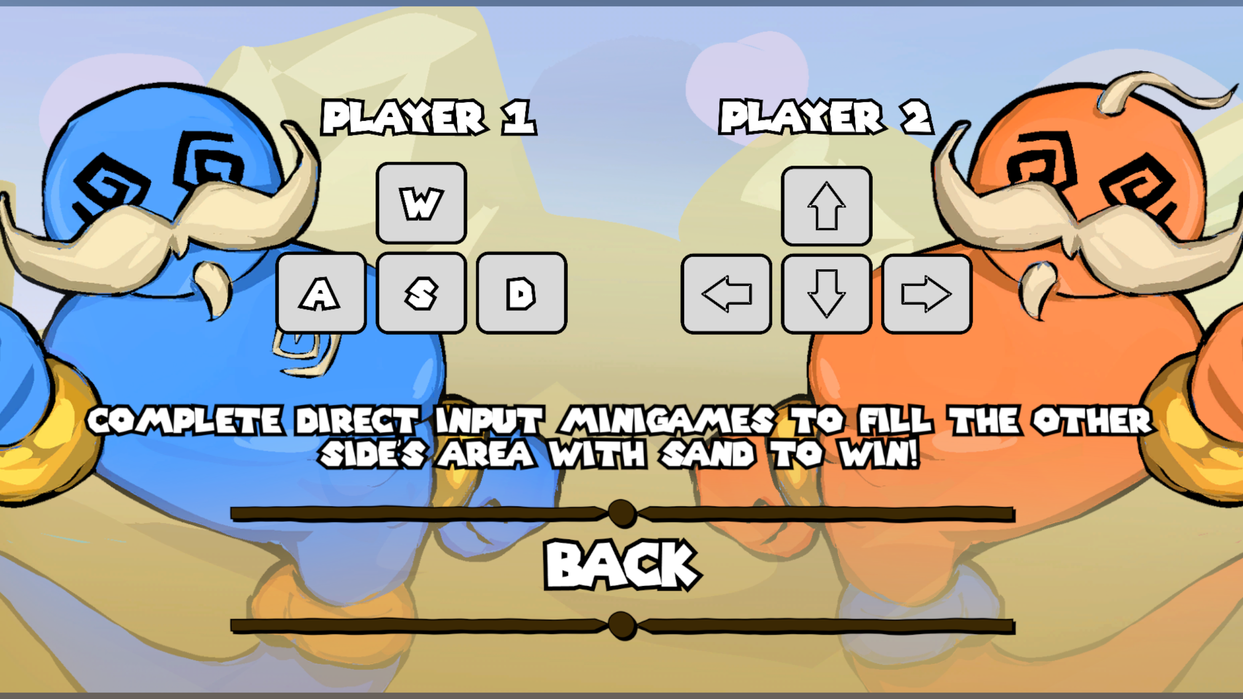
3. Tutorial Layout
Despite the limited development time, a few pairs of people playtested the game. The team wanted to ensure basic controls were communicated in-game, not just on the itch.io page, so I made this tutorial screen. People found it efficient and clear in communicating how movement works and what control methods belong to which character.
-
![]()
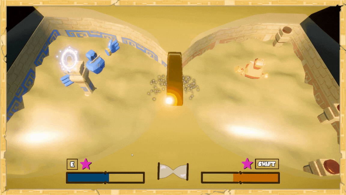
4. In-Game UI
The most immediately notable UI is the collection of assets towards the bottom of the screen. It stays out of the way of the playing field, and it communicates the most vital information. Because of how fast each match moves, players and team members weren’t fully focused on how much sand their side was filled with. All of their focus was on hitting pillars and engaging with the input mini-game. Each player has a bar that representing their colors and the amount of sand their side is filled with. Between the bars is a hourglass that quickly communicates which direction the arena is tilting. It all comes back to communication, having an easy to read piece of UI that allows the player understand what’s going on at a glance.
Beyond the bars and hourglass, key prompts for when a player can interact with an object, along with the corresponding key helped reduce confusion. There was a desire to have the prompts appear close to the interactable object, but I did not get around to that, unfortunately.
The input mini-game needed to be communicated clearly, so thick, bold arrows were the way to go.
-
![Scripting]()
5. Scripting
I wrote all the scripts involving the UI. Due to most of my time being spent on designing, the scripts were made quickly and focused on basic functionality.
Here you can download my scripts and take a closer look at them.